
Hey, it’s Ethan Bellweather. After years at SOM and now with my own studio, Bellweather Design Studio, I’ve realized architecture is more than just walls and roofs. It’s about creating experiences. And color? Color is the secret weapon. It shapes how we feel, how productive we are, and our overall well-being in a space. Let’s explore how to use color psychology to design interiors that truly connect with people.
Color Psychology 101: What’s the Big Deal?
So, what is color psychology? Simply put, it’s how colors affect our emotions and behavior. These effects aren’t random. They’re often tied to culture, biology, and even personal memories. Before we grab a paintbrush, let’s understand these basic principles.
Think about it: a stark white hospital room might feel clean to some, but cold and impersonal to others. A bright red office could boost energy, but also cause anxiety. The trick is to understand these potential impacts and tailor your colors to the space’s purpose.
Decoding the Emotional Spectrum: Color by Color
Let’s break down some common colors and how they typically make us feel:
- Red: The Energy Booster. Red screams energy, passion, and excitement. It can speed up your heart rate and boost your appetite, which is why you see it in restaurants and gyms. But too much red can be overwhelming, even aggressive. Use it as an accent to add some zing.
- Blue: The Calming Influence. Blue is all about peace, trust, and intelligence. It can lower blood pressure and help you relax, perfect for bedrooms, bathrooms, and offices where you need to focus. Careful, though! Too much cool blue can feel a bit depressing.

- Yellow: The Sunshine Color. Yellow is happy, optimistic, and creative. It can lift your mood and get your brain going, making it great for kitchens, playrooms, and creative spaces. But watch out – yellow can be overpowering and strain your eyes. Use it in small doses and balance it with other colors.
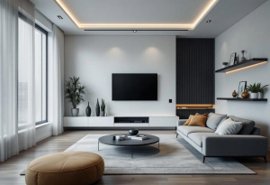
- Green: Nature’s Embrace. Green represents nature, growth, and balance. It’s calming and can reduce stress, making it ideal for living rooms, offices, and even hospitals. Different shades evoke different feelings. Darker greens feel sophisticated, while lighter greens feel fresh.
- Orange: The Enthusiast. Orange is energetic, creative, and warm. It encourages conversation and creates a welcoming vibe, making it a good choice for living rooms, dining rooms, and entryways. Like red and yellow, orange can be a lot, so use it thoughtfully with cooler colors.
- Purple: The Royal Treatment. Purple is often linked to royalty, luxury, and spirituality. It can spark creativity, wisdom, and sophistication. It’s a nice touch for bedrooms, meditation spaces, or anywhere you want a sense of calm. But purple can also feel a bit somber or mysterious, so go easy and consider lighter shades like lavender.
- White: The Blank Canvas. White represents purity, cleanliness, and simplicity. It can make a space feel bigger and brighter. It’s super versatile, but add warmth and texture so it doesn’t feel sterile.
- Black: The Dramatic Accent. Black is sophisticated, powerful, and elegant. Use it sparingly as an accent to create contrast and highlight other features. Too much black can feel heavy, so balance it with lighter colors and lots of light.
Color Combos: Creating the Right Vibe
Colors are powerful alone, but the real magic is in how you combine them. Different color palettes can create totally different atmospheres. Here are a few popular schemes:
- Monochromatic: Think different shades of the same color. It’s sophisticated and calming, perfect for creating a relaxing space.
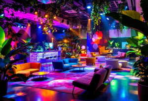
- Complementary: Colors opposite each other on the color wheel, like blue and orange, or red and green. This creates a bold, energetic contrast – great for spaces where you want to spark activity.
- Analogous: Colors next to each other on the color wheel, like blue, blue-green, and green. This is harmonious and balanced, ideal for a tranquil feel.
- Triadic: Three colors evenly spaced on the color wheel. This creates a playful, bold look, best used where you want a sense of fun.
The key? Experiment! Find the combinations that match your style and the mood you want to create. Don’t be afraid to break the rules and invent your own palette!
Culture and You: Color is Personal
While colors have general associations, remember that perception is personal. Culture, experiences, and even individual preferences play a role. For example, white means purity in Western weddings, but mourning in some Eastern cultures. A color that brings back happy memories for one person might trigger something negative for another.
When designing for a diverse group, be aware of these cultural and personal nuances. Research the cultural meaning of colors in different regions, and consider your client’s preferences. Ask questions and get feedback to ensure your color choices resonate with everyone using the space.
Color in Action: Practical Tips for Architects
Okay, enough theory. Let’s get practical. How do we use color psychology in architectural designs? Here are a few ideas:
- Define the Space’s Purpose: What will happen here? What mood do you want to create? Productivity? Relaxation? Creativity? Answering these questions helps narrow down your color options.
- Consider the Light: Natural and artificial light can drastically change how colors look. Test your samples under different lighting to see how they shift throughout the day.
- Highlight Architectural Features: Use contrasting colors or accent walls to draw attention to specific design elements.
- Create a Sense of Flow: Use a consistent color palette throughout the space for continuity and harmony.
- Don’t Be Afraid to Experiment: Try different combinations and see what works. Use paint samples, mood boards, and digital tools to visualize your ideas before you commit.
- Balance Bold Colors with Neutrals: If you’re using bright, saturated colors, balance them with neutral tones so the space doesn’t feel overwhelming.
Unlocking the Power of Color
Color is more than just a visual element; it’s a powerful tool. It shapes our perceptions, influences our emotions, and enhances our well-being. By understanding color psychology and applying it thoughtfully, we can create spaces that are not only beautiful but also truly harmonious and inspiring. So, go ahead, embrace color and design environments that speak to the soul.
What are your favorite color combinations, and how do you use them in your designs? Share your thoughts in the comments!
Hey, it's Ethan Bellweather here. For years, I've been neck-deep in the architecture and design scene. From my days at Read more
Hey, I'm Ethan Bellweather. I'm an architect obsessed with merging sustainable design with all the coolest tech. Forget just sticking Read more